
Visual identity system for Cherith and its business units. Color, typography, illustration, and application standards.
Raven, Sand, Oxblood.
High contrast foundation. Dark mode default, light sections for relief. No warm tones except oxblood. Nothing muddy.
Application Rules
Do
Dark mode default (Raven backgrounds). Use Sand/Salt for relief sections. Core palette (Raven + Sand + Oxblood) for all primary brand applications. High contrast always.
Don't
Don't use warm tones beyond Oxblood and Ochre. Don't use low-contrast pairings. Don't let unit accent colors dominate the parent brand. Don't mix multiple accent colors in one composition.
GT America family.
A super family with 400+ styles. Mono for the wordmark and technical contexts. Sans for headlines and body. Swiss rationalism with the analytical precision Cherith demands.
| Role | Typeface | Weight | Usage |
|---|---|---|---|
| Wordmark | GT America Mono | Bold | Logo lockup, all caps |
| Headlines | GT America | Medium + Thin Italic | Hero text, section headers — weight contrast pattern |
| Body | GT America | Regular / Book | Paragraphs, descriptions (16-18px, 1.6 line height) |
| Technical | GT America Mono | Regular / Medium | CTAs, labels, data, section markers |
Pattern: Headline Weight Contrast
Headlines use two weights within a single line to create internal hierarchy. The substantive words — the concepts that carry meaning — are set in GT America Medium. The connective words that link them ("deployed for," "built on," "rooted in") are set in GT America Thin Italic.
This draws the reader's eye to the words that matter and gives the headline a cadence — weight, breath, weight.
GT America Mono.
The wordmark is set in GT America Mono Bold, all caps. The mono spacing creates precise, mechanical rhythm. Institutional presence through weight and tracking.
Tracking: +4px at display sizes

The raven descending.
The raven descending at 45 degrees, bread in beak. The moment of provision from the Cherith narrative (1 Kings 17). Not a generic bird — the moment God provided for Elijah through unexpected means.
| Attribute | Specification |
|---|---|
| Orientation | Descending at 45 degrees — arriving, not attacking |
| Detail | Bread visible in beak (the provision, the gift) |
| Execution | All-black, reads as raven (not eagle, not hawk) |
| Posture | Wings back in descent, dynamic but purposeful |
| Pairing | Left of or above the all-caps mono wordmark |
Mark Color Treatments
 Raven #1A1A1A
  Oxblood #6B1C23
  Sand #E2DED4
  Salt #FFFEFB
 Lockup Hierarchy

Wordmark Treatments


One family, distinct roles.
Cherith operates through focused business units sharing the parent brand system. Each unit inherits the core palette and type system, with an optional accent color for differentiation.
Research, experimentation, and incubation. Technology for difficult places.
Capital deployed where it matters most. Partnering with investors who share the conviction.
Community and spiritual formation. The provision narrative lived in relationship.
Operational infrastructure for church planters using business in restricted regions.
Navigation System
Primary navigation uses four labels. Consistent across all pages.
Salt background | Oxblood wordmark | Fixed position | Shadow: 0 1px 2px rgba(0,0,0,0.3)
Buttons, cards, patterns.
Consistent interactive elements across all applications. Pill-shaped buttons, bordered cards, and oxblood rule patterns.
Buttons
All buttons: 50px border-radius (pill), 1px border, GT America Mono Medium 13px, all caps, 1px tracking, 16px/24px padding.
Section Patterns
| Pattern | Background | Text | Usage |
|---|---|---|---|
| Dark section | Raven #1A1A1A | Salt + Brushy | Heroes, approach sections, CTAs |
| Light section | Sand #E2DED4 | Raven + Slate | Content sections, cards, forms |
| Accent section | Oxblood #6B1C23 | Salt + Oxblood | Process steps, featured content |
| Nature section | Sage #7F846E | Raven + Slate | Data/metrics, opportunity |
Pull Quotes
"We operate like a kingdom hedge fund — finding the greatest dislocations and inefficiencies in global mission, then deploying resources where they'll matter most."
3px Oxblood left border | 22px italic | 32px left padding
Floyd-Steinberg dithered landscapes.
A reproducible illustration style using Midjourney with locked style references. Photorealistic landscapes rendered through computational dithering — digital and systematic, not handmade. Characters (Elijah, the Raven) are composited as a separate animation layer.
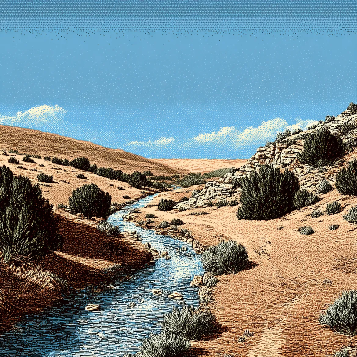
Anchor example: Arid landscape with brook. Dithering visible in the sky gradient; earth tones map directly to the brand palette (Sand, Sage, Brook, Raven).
Story Section — Character Composites
The Elijah narrative rendered in two eras. Same brook, same raven, same posture — ancient and modern. Characters are composited into Floyd-Steinberg landscapes as a separate layer.
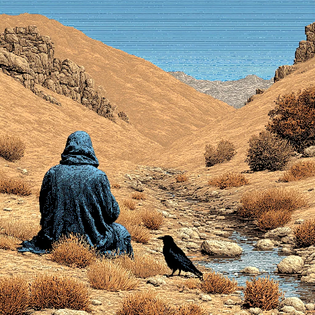
Hooded figure, dark robes, raven at his side. Biblical wilderness — no civilization.
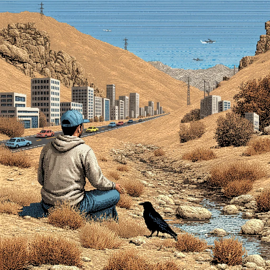
Contemporary figure, same brook, same raven. City visible in the distance — the story is timeless.
What It Is
Sophisticated error-diffusion dithering applied to rich landscapes. Fine, nearly invisible pixel grid at normal viewing distance. Smooth tonal gradation with rich midtones.
What It Is Not
Not halftone dots. Not crosshatch. Not pointillism. Not hand-drawn or analog. Not low-resolution or retro. The dithering should be subtle — visible on inspection, invisible at a glance.
Color Palette
Muted earth tones: sand, wheat, sage green (#7f846e), dusty blue (#7da1b4), raven brown (#1c1b19). Warm but not saturated. Atmospheric, not vivid.
Character Layer
Figures are animated separately via Nano Banana/Gemini compositing and Veo for motion. Landscapes are the world; characters inhabit them. This makes illustrations narrative, not decorative.
Photography (If Acquired)
Do
Architecture (cathedrals, libraries, research facilities). Hands at work. Technology infrastructure. Abstract light, shadow, texture. High contrast, desaturated or duotone treatment.
Don't
No stock photography. No smiling people at cameras. No tech startup aesthetic. No religious cliches (sunbeams, stained glass, praying hands). No warm or cozy lighting.
Before any deliverable.
Verify every design output against these standards.
| # | Check |
|---|---|
| 1 | Color usage within system (Raven, Sand, Oxblood core; extended palette as needed) |
| 2 | Typography pairing correct (GT America family throughout) |
| 3 | Mono reserved for wordmark, CTAs, technical/data contexts |
| 4 | No generic imagery (stock, clip art, or unstyled photos) |
| 5 | High contrast maintained (nothing muddy or low-visibility) |
| 6 | Pattern/texture adds, doesn't distract |
| 7 | Feels "technical precision + theological weight" |
| 8 | Provision narrative present (even if subtle) |
| 9 | Nav reads: Thesis | Labs | Capital | Careers |
| 10 | OPSEC review completed for any geographic/partner specifics |